A UXer with an MBA, because UX is serious business
UI Design
Project Lead, UI Design, Design Documentation
In 2016, Invesco, a global asset management firm, started on a multi-year refresh of the Invesco US digital presence. Along with a structural and functional refresh, the redesign also included a first attempt at the creation of a systematic design system, the Invesco Visual Language.
The goals of the visual language were to:
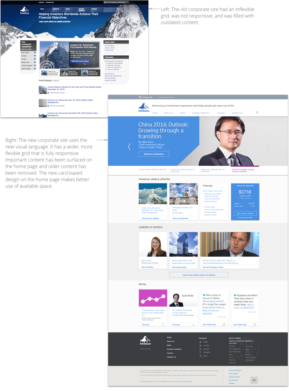
A Beta version of the core design elements was used in the redesign of the Invesco Corporate site, which launched late 2016. This launch was the first introduction to the design system and served as the first iteration of the visual language.
In 2017, the full-scale redesign of the US site was kicked off. I catalogued and reviewed every element and component of the existing site to identify commonalities and duplications. This inventory allowed me to break down the components into atomic elements. A refined version of the visual language was then applied to the elements, which were then used to redesign the core areas of the US site.
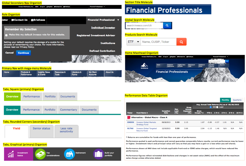
Above: Excerpts from the component audit breakdown into Atomic elements.
The first part of the new design to go live was updated landing pages for the different roles. Over the course of 2017, the visual language was also applied to the Products and Insights sections, which are still in development. Working with other UX team members, we also created new icons and included them in a custom icon font to ensure scalability.
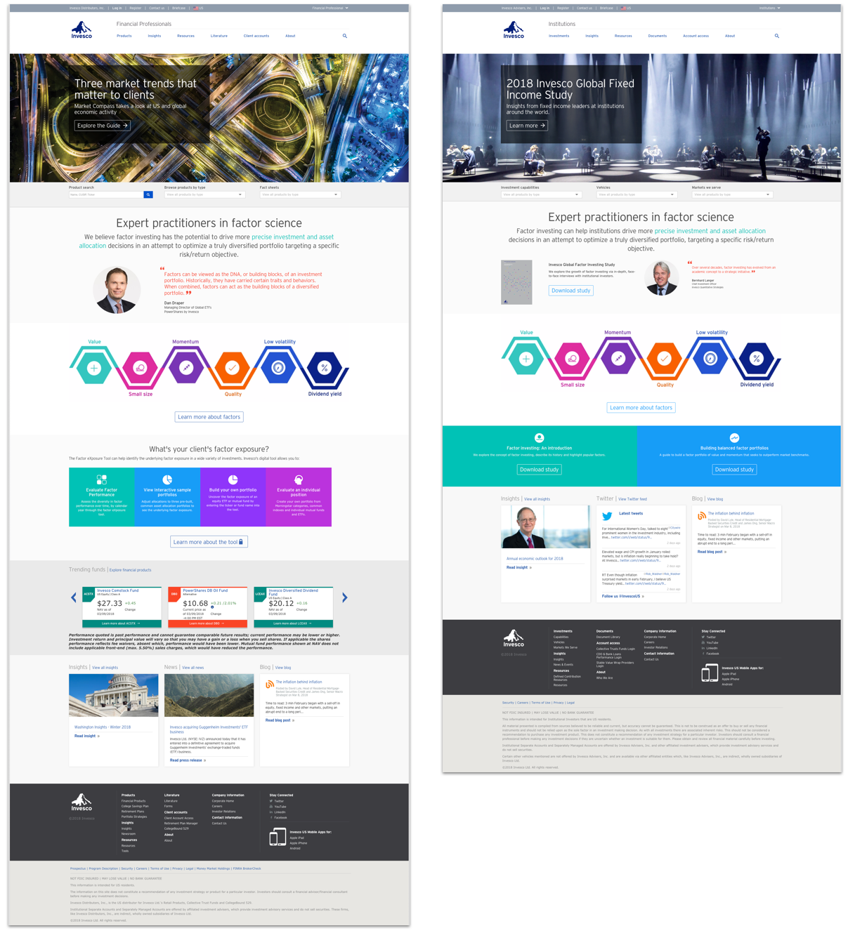
Above: New landing pages for the Financial Professional and Institutional roles.
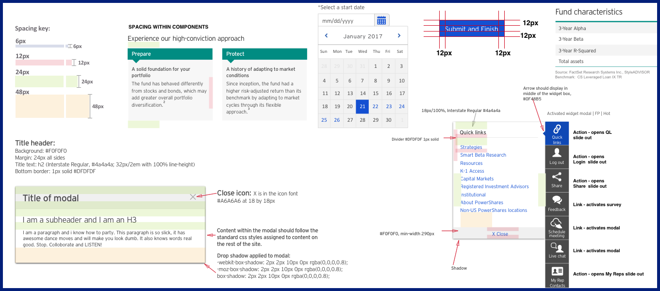
The existing US and corporate sites were a hodge-podge of different design elements and styles, with little consistency across the sites. Multiple UX designers and developers had shaped the site over the past several years with no clear overarching vision. Marketers had also used production requests as a way to alter different sections of the site. Cataloging and standardizing the site elements with clear directions for usage was a necessary step that was time-consuming yet completely necessary. The creation of an InVision board that housed the elements and their instructions for development and use helped to speed up the overall design and development process and provided clear guidelines for marketers.
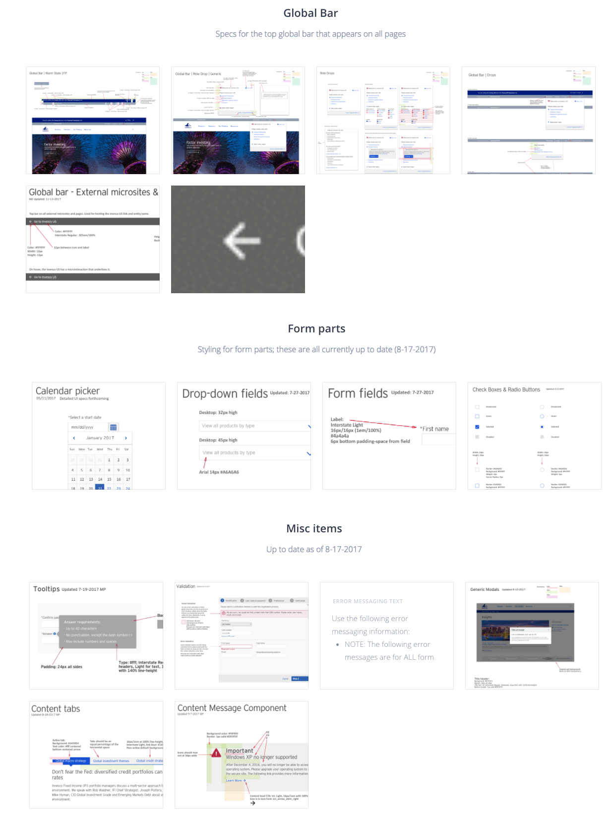
Above: Excerpt from the InVision Visual Language board used to store the UI elements and guidelines.
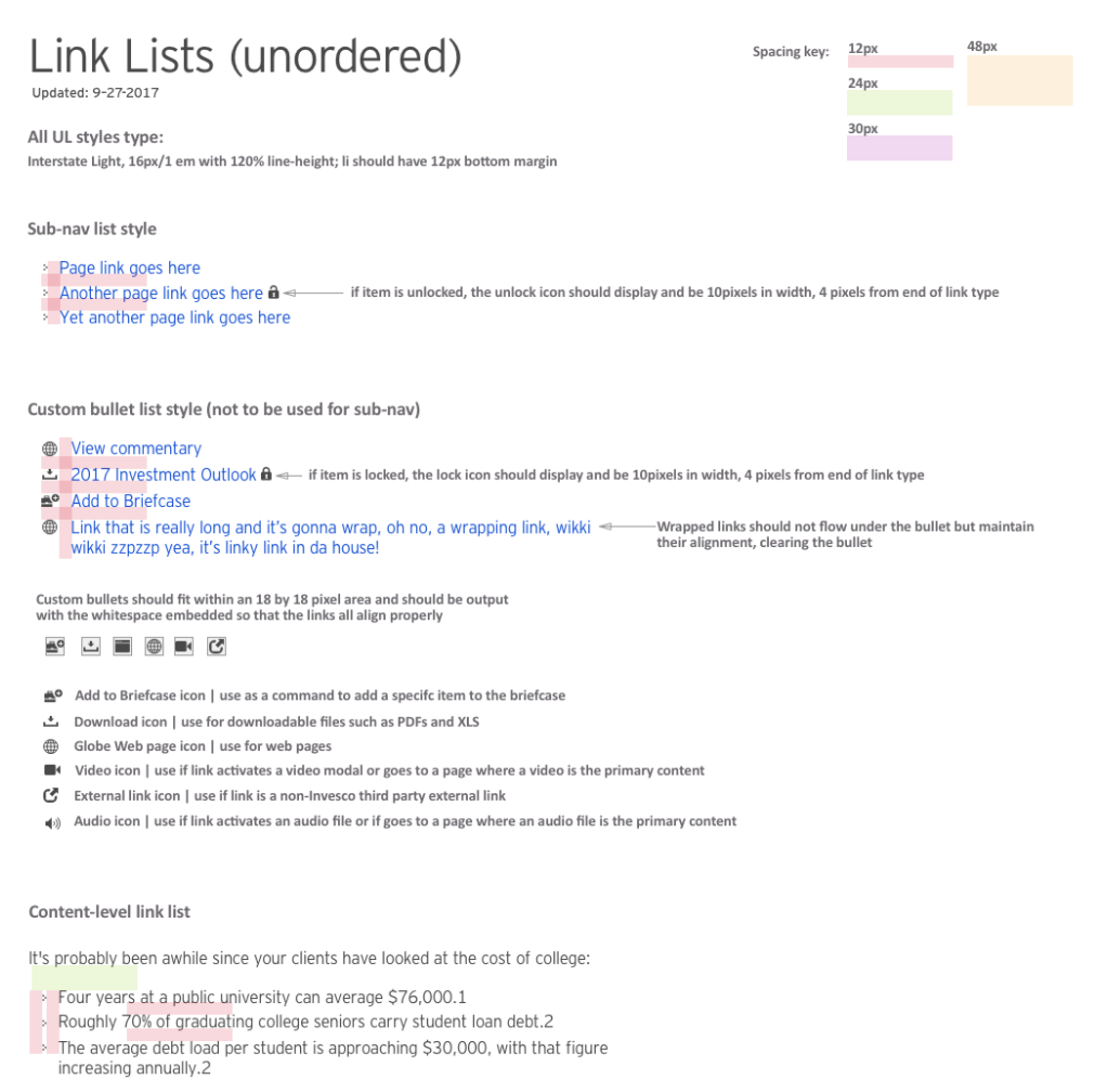
Above: UI design and guidelines for handling Link Lists.
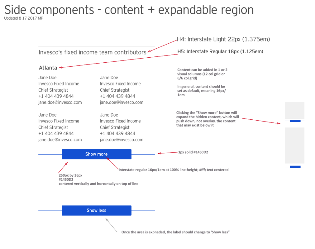
Above: UI design and guidelines for side components.