A UXer with an MBA, because UX is serious business

Redesign - 2018
Project Lead, UX Strategy, Competitive Analysis, Interaction Design, UI Design, & User Testing
Invesco is a leading global asset management firm. In mid-2016, Invesco started on a multi-year redesign project that included a complete visual and structural overhaul as well as a migration to a new CMS. The project was broken into multiple smaller projects spanning several sprint teams. Each smaller project had different business requirements and reasons for being updated.
Some of the core issues with the site that we were trying to overcome were:
The Invesco US redesign project started with the creation of a beta version of a new visual language for Invesco. This design system was applied to the Invesco Corporate site, which launched in late 2016. Updated landing pages were then launched. The full-scale redesign effort was officially kicked off in January of 2017.
Following a component inventory, the visual language was further defined and applied to dozens of components and design elements (view the visual language case study). The major areas of the site were then tackled area by area by cross-functional working teams.

We started with the most critical areas of the site, the Pricing and Performance areas. I did comprehensive competitive and industry research, resulting in a detailed report of findings and recommendations. Several competitor sites were also tested to validate existing assumptions. Mocks based off the new visual language were created that sought to overcome current deficiencies and provided an easier to consume display of complex financial data.
Recommendations for improvements included:

Above: The Pricing + Performance page for Mutual Funds.
Above: Video of the new filter prototype for products.

Above: A product page for a mutual fund. The product pages were cleaned up with less overall copy, bigger text, and more whitespace. The design changed from a multi-tabbed, many-click page, to a long-scrolling page that was easier to consume and print with no unnecessary clicks.
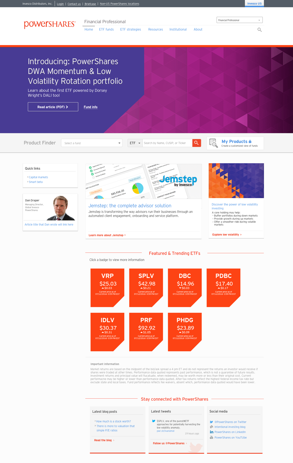
One of the few produces that Invesco carries that can be purchased by consumers directly is PowerShares ETFs. It was critical that this section's content was catered to the consumer versus financial professionals.
I worked with our content strategy team and brand marketers to focus the content on the consumer and to make it as easy as possible for conumers to find appropriate ETFs.
The new visual language was applied to this section, while also keeping the unique branding of PowerShares intact.

Above: The main page for the POWERSHARES ETFs section of the Invesco US site. POWERSHARES has a distinct brand that needed to be integrated intot he overarching Invesco visual language.
Another important area of the site is the Insights section. This section is a collection of thought leadership on a myriad of financial topics. As the primary persona for the site is the financial professional role, this was a very important area to get right.
A working team was set up consisting of UX, content strategy, product owners and developers. Research from both UX and content strategy was shared and compared and a unified set of recommendations was put forth. New mocks were created and tested and then presented to the larger team for buy-in.
Recommendations for improvements included:

Above: The default view of the Insights landing page. Improvement include a new filtering system and easier to read previews of each article.

Above: Updated layout for an individual Insight article. Larger more engaging images were used along with article summaries, categorization, and easy access to other articles.
A common complaint from users on the site, no matter which role, was how hard it was to just get to the main landing pages and then choose the correct role. The gateway was viewed by many as a wall that prevented users from accessing the site efficiently.
A working team was created and competitor research was undertaken. New mocks were created and then tested. The new designs improved upon the process and were easier for users to understand which role they should choose.

Above: Updated gateway with integrated role selector. Users have two ways to navigate, either with the large role call to actions, or by using the role selector drop-down.
Work done while employed at Invesco, 2018