A UXer with an MBA, because UX is serious business
research project | 2018
User Research + Testing; Recommendations Report; Information Architecture; UX Design; UI Design
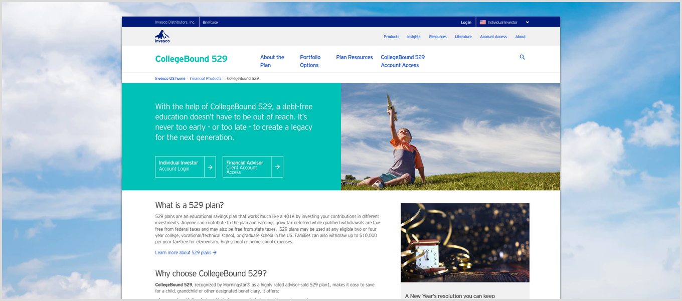
Invesco is a leading global asset management firm. As part of an existing Invesco US site redesign, the sites' CollegeBound 529 section needed to be reviewed and adjusted to better align with user goals and to help increase overall plan conversions.
In order to comply with company and legal regulations that restricted direct access to users, I set up two separate remote unmoderated user tests, one with ten individual investors and one with ten financial professionals.
I wrote user scripts that sought to gather: basic demographic data; testers plans for paying for college (Individual Investors); perceptions of college 529 plans in general (both roles); and whether or not they ever sold 529 plans (Financial Professionals).
"I am not a paper pusher, this isn't my responsibility." A direct quote from one of the financial professionals in regards to opening 529 plans for their clients.
Based on the two studies, I worked with our senior content strategist and product owner to create a simplified navigation flow for the 529 section, along with recommendations for content and feature improvements, such as:
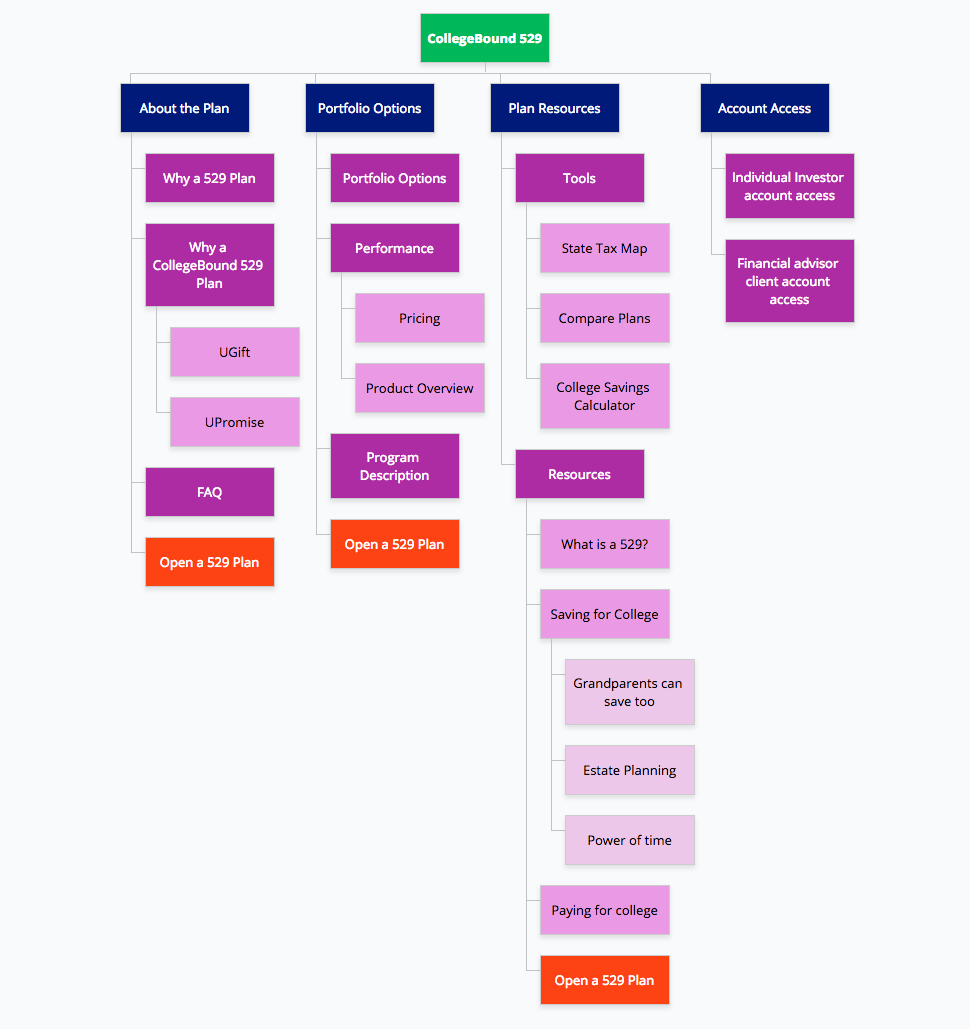
Above: I reorganized the navigation for the 529 section by reducing the top tier options and by pulling in resources and tools into the 529 section directly, rather than have them in another section of the site like they are currently. The Open a 529 link is now repeated in multiple areas to increase discoverability. Account access is also now in its own section so as to reduce confusion with site-level role access.
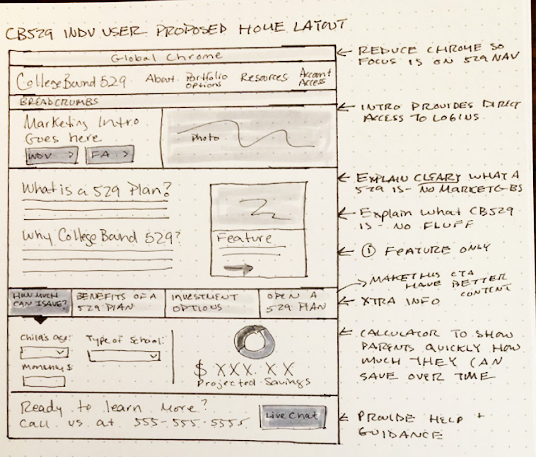
Above: This wireframe sketch combined several of the recommendations that came from the research, such as simplified content and a calculator to show users how much their money could grow over time.
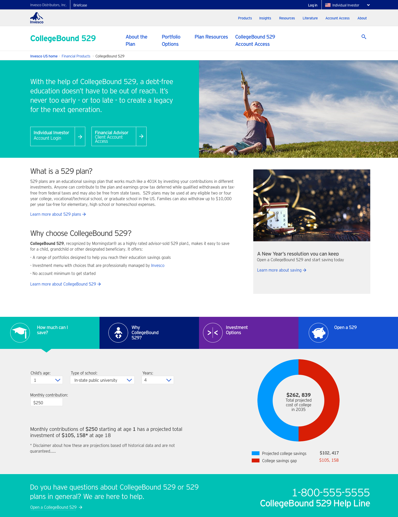
Above: Preliminary high-fidelity mock of the CollegeBound 529 updates for the Individual Investor role. The intro copy has been streamlined, access to accounts is front and center, and an interactive calculator is available by default. I also suggested that a means to connect to help be available from the main landing page.
Invesco US Digital Visual Language
The first step in creating the Invesco Design System was designing a comprehensive visula language that could be applied to all digital work.
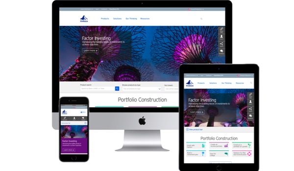
Invesco redesign + design system
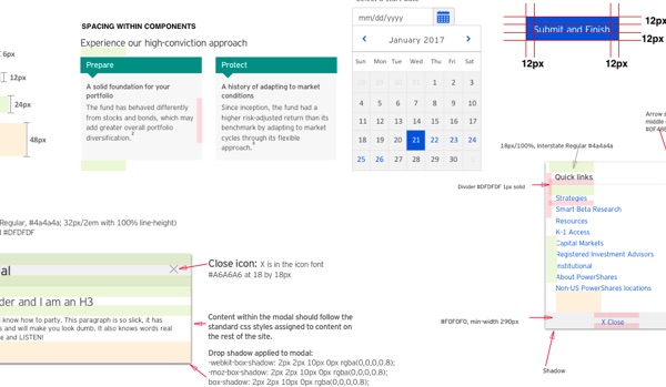
I created a new design system and visual language theat was applied to the corporate and US website redesigns.